How To Pick a Color Scheme for Your Workplace
/Choosing colors for your workplace can be a daunting task, especially if you have many spaces with different functions serving a lot of people. There are many questions to consider:
- What mood do you want to create?
- Do you want the color scheme of your office to be light or dark?
- Do you want to walk into a space full of fresh, invigorating energy or an oasis of peace and calm?
- Do you prefer a look that is casual and laid-back or something more formal and tailored?
- Do you need to include existing furniture, decor and accessories or are you starting from scratch?
You can take a completely intuitive approach and go with everyone’s favorite colors – or you can try one of the more of the tried and true ways described below.
Let’s begin with just a dash of color theory. This is the color wheel you’re probably already familiar with. It’s a very handy tool for doing anything with color. I will be referring to it throughout this article.
1. Complementary color scheme.
This can be a powerful solution, because it is based on two colors that augment and amplify each other. To find a pair of colors like this, pick any color and then look directly across the color wheel for its opposite, or, in color-theory speak, its “complement.” Popular examples are blue and orange, red and green, purple and yellow.
2. Analogous color scheme.
This option is based on colors that are similar to each other. Pick a color and then grab its neighbor on the color wheel to arrive at an analogous color scheme. It can be a color on the left or the right of your main one, or you can include both of the “neighbors” in your scheme. Examples: orange, red and purple.
3. Triadic color scheme.
By definition, this color scheme includes three colors. To create a triadic color scheme, pick three colors that are the same distance from one another. A very common example of a triadic color scheme is red, blue and yellow (also known as primary colors). Imagine taking the triangle that includes these three primary colors and rotating it along the color wheel. Any of the colors that land on a triangle will give you a triadic color scheme.
4. Monochromatic color scheme.
Although it sounds like a simple approach, a monochromatic color scheme can actually become an amazing aesthetic. Working from a single base color, experiment with hue and a variety of shades, tints and tones. Use contrast to bring in at least one darker and lighter shade of the original color. An effective monochromatic color scheme creates a feeling of balance and harmony and draws attention to room content.
5. Neutrals.
It's worth pointing out that neutrals are not limited to shades of gray. White is a neutral color, as is black – though both of them pack some punch and can be overwhelming in large quantities. We often perceive colors of wood, either natural or stained, as neutral. Neutral colors tend to evoke associations with the natural world, although too much of beige, taupe and gray can make one feel tired.
A couple more tips:
- Pick a neutral color to go with your color scheme.
- Do not distribute your colors equally. Choose a main color and give it 70 % of the space; give 25% to accent color #1 and only 5% to accent color #2. These numbers are arbitrary, and merely illustrate my point – have a main color and a secondary color, and then some accents. Avoid painting the four walls of a room all different colors (unless you are making a statement that you can defend in front of your coworkers).
- Tap into your brand colors, if you have any. Is your logo navy blue with black and white? Take the blue and apply one of the color schemes above to it. Would it look good with a zing of yellowish orange (complementary), paired with baby blue and lime green or in concert with crisp red and muted yellow?
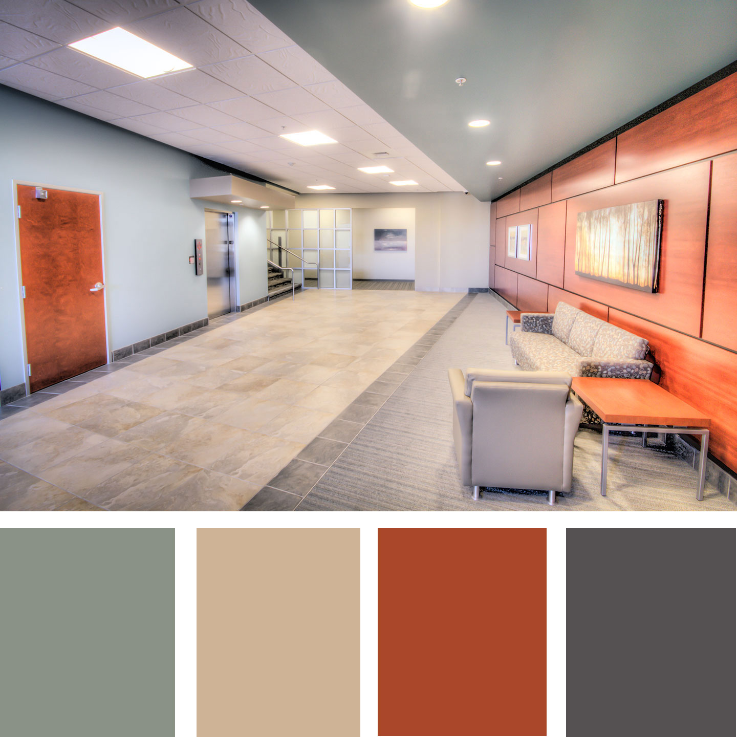
- All of the color wheel colors can also be turned up or down in terms of intensity (saturation) and value (how light or dark the color is). Unless your office is also a day care center, you want the variety in both intensity and value (think muted vs saturated, light vs dark colors). The image below is an example of a complementary color scheme with very muted and grayed-out mint color and vibrant reddish-orange wood tones. The whole space feels natural and fresh.
And if, after going through all the color schemes, you still make your decisions based on your intuition – go for it! At least now you know there is a rhyme and reason for it.


